
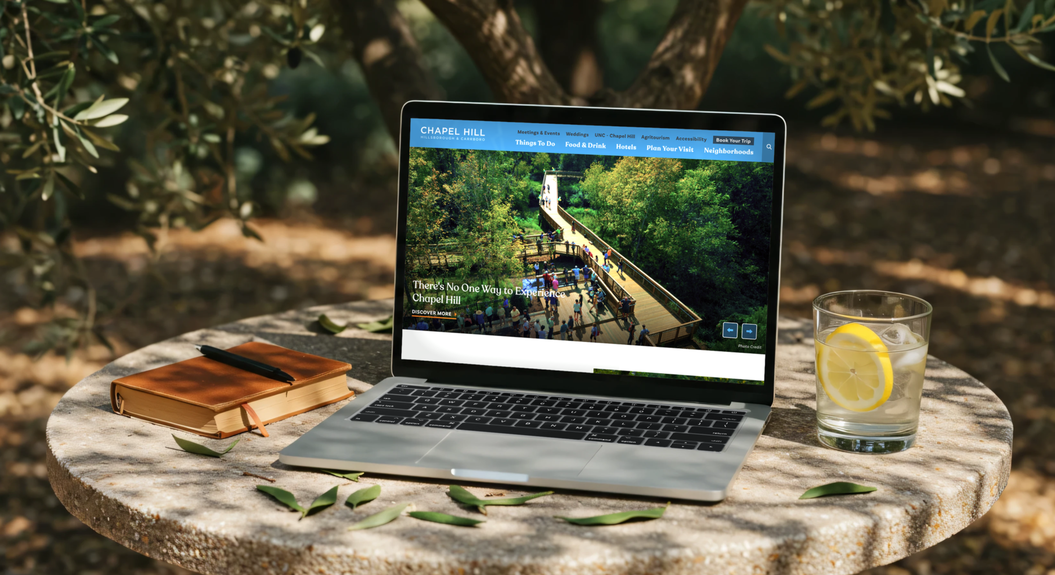
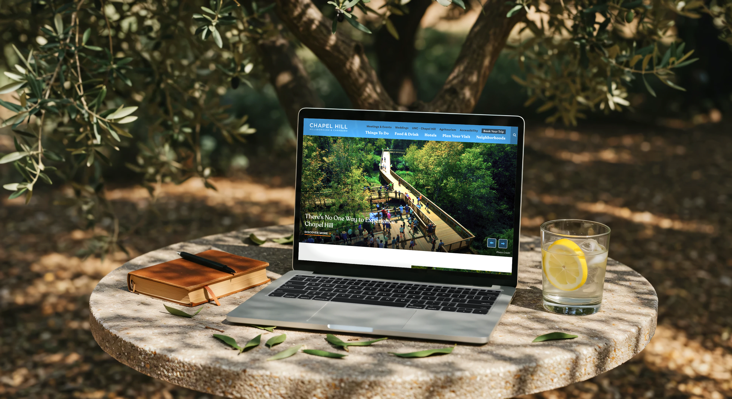
Visit Chapel Hill
Client: Chapel Hill/Orange County Visitors Bureau
Visit Chapel Hill needed a fresh, inclusive, and easy-to-navigate digital experience that captured the warmth of the destination while welcoming visitors of all ages and abilities. As the primary UX/UI designer, I led the redesign of the main leisure website, an accessibility-focused microsite, and the Sneak Piques storytelling microsite.
Over the course of a year, I collaborated with stakeholders, PMs, developers, and creative leadership to shape the user experience, simplify the site structure, improve navigation, strengthen accessibility, and create flexible layouts that could grow alongside the destination’s evolving content needs. The result is a unified, modern, and welcoming digital experience that helps visitors explore with confidence while giving the client a strong foundation for the future.
01 The Challenge
The original Visit Chapel Hill website had grown over time, creating challenges for both visitors and the destination team. The experience had become difficult to navigate, with opportunities to improve content organization, accessibility, and overall usability.
My goal was to create a clearer digital experience that made it easier for visitors to discover Chapel Hill while giving the client a flexible foundation that could support future growth.
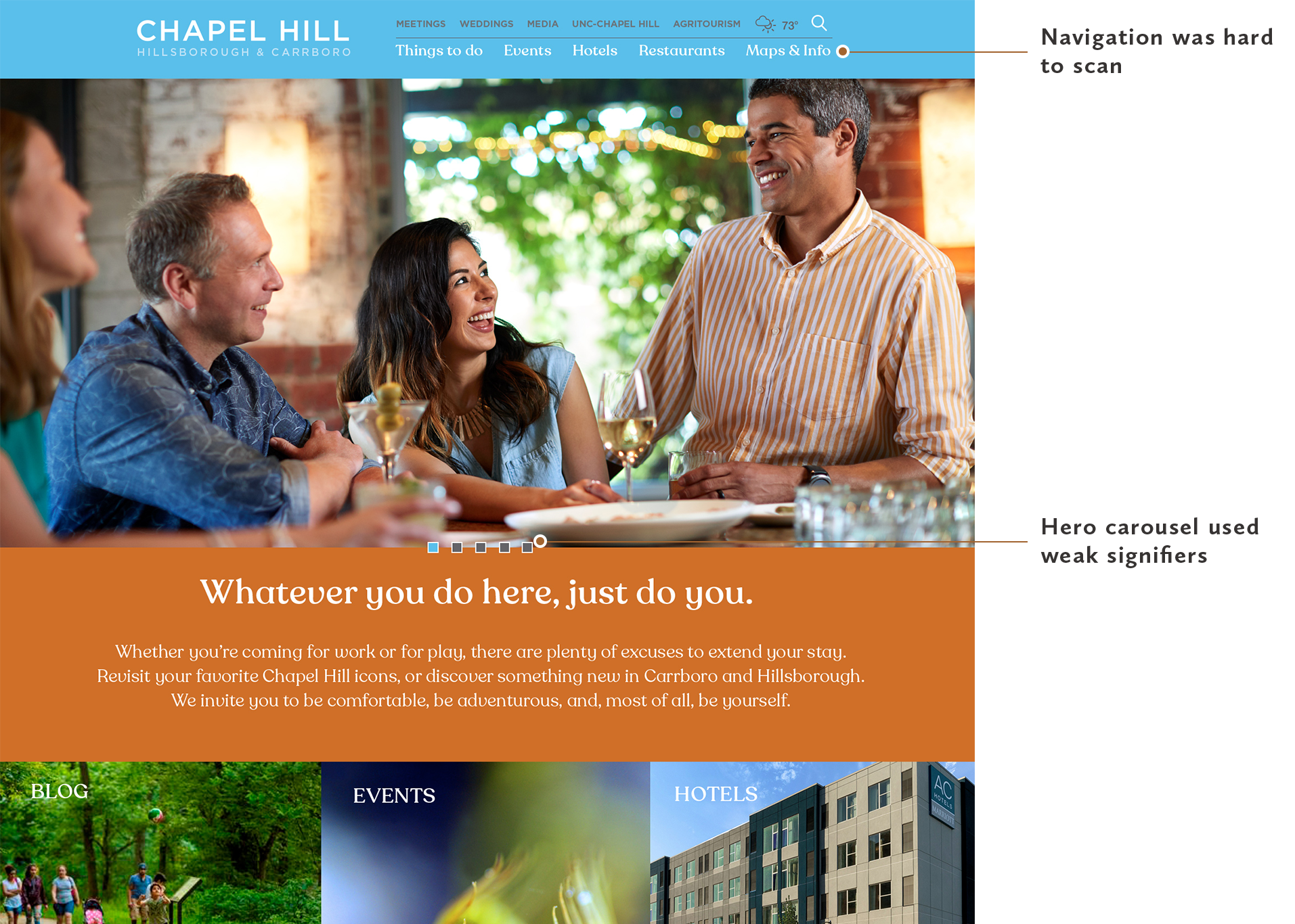
Before - Previous Website
An outdated, content-heavy experience with unclear navigation and weak carousel signifiers.
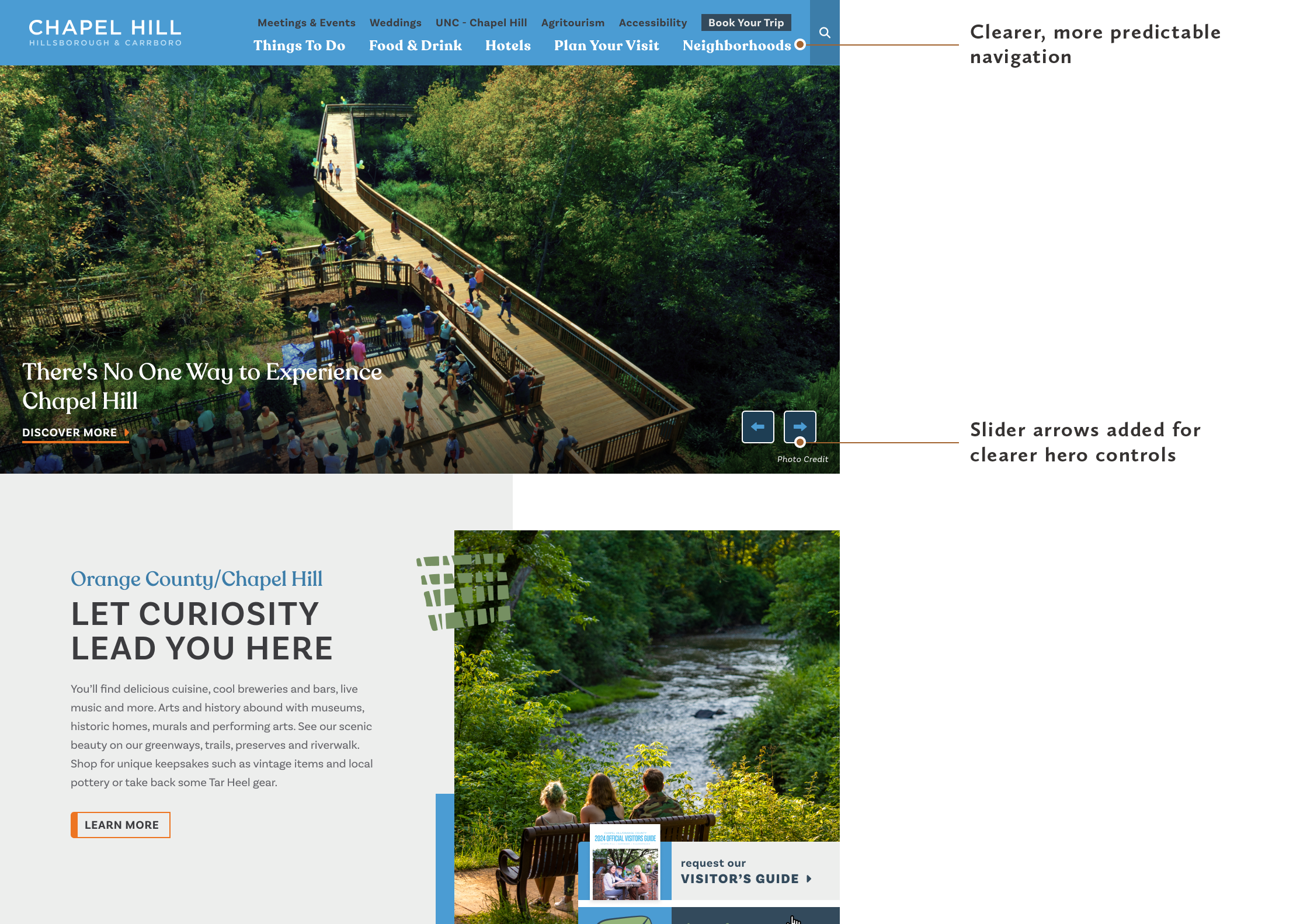
After - Previous Website
Clearer hierarchy, stronger accessibility, and more intuitive controls.
02 Project Goals
The redesign focused on creating a more welcoming and accessible experience while balancing the needs of visitors, content creators, and the destination brand.
Simplify Navigation
Create clearer pathways that help visitors quickly find inspiration events, and trip-planning resources.
Improve Accessibility
Design a more inclusive experience through improved readability, contrast, and predictable patterns.
Enhance Storytelling
Create opportunities to showcase Chapel Hill’s unique personality, community, and experiences.
Build for Growth
Develop flexible layouts and components that could evolve with future content needs.
03 Design Approach
Creating a successful digital experience required balancing three key considerations: telling the story of the destination, creating an accessible visual system, and designing an intuitive experience for every visitor.
Experience Strategy
The original Visit Chapel Hill website had grown over time, making it harder for visitors to navigate and discover relevant content. The goal was to simplify the experience, create clearer pathways, and establish a stronger foundation that could support the destination’s evolving digital needs.
Key focus areas:
Rebuilt the information architecture to create clearer navigation pathways
Simplified content presentation to reduce cognitive load and improve discoverability
Created more predictable layouts and patterns to support easier exploration
Established a UX foundation that later guided the accessibility and Sneak Piques microsites
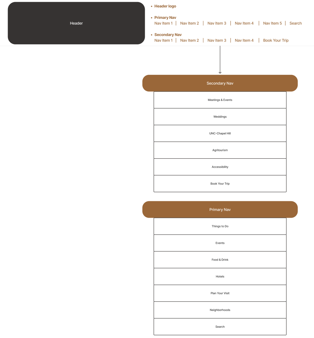
Navigation Structure Organized primary and secondary navigation to create clearer pathways while keeping key planning and booking actions easy to find.
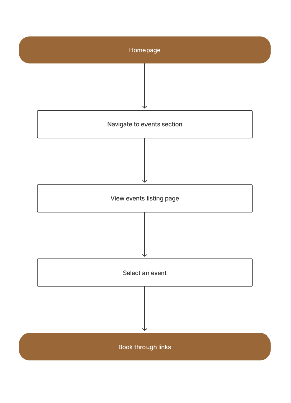
Event Discovery & Booking Flow Mapped a straightforward path from event discovery to booking to reduce friction and help visitors move confidently toward action.
Visual Direction
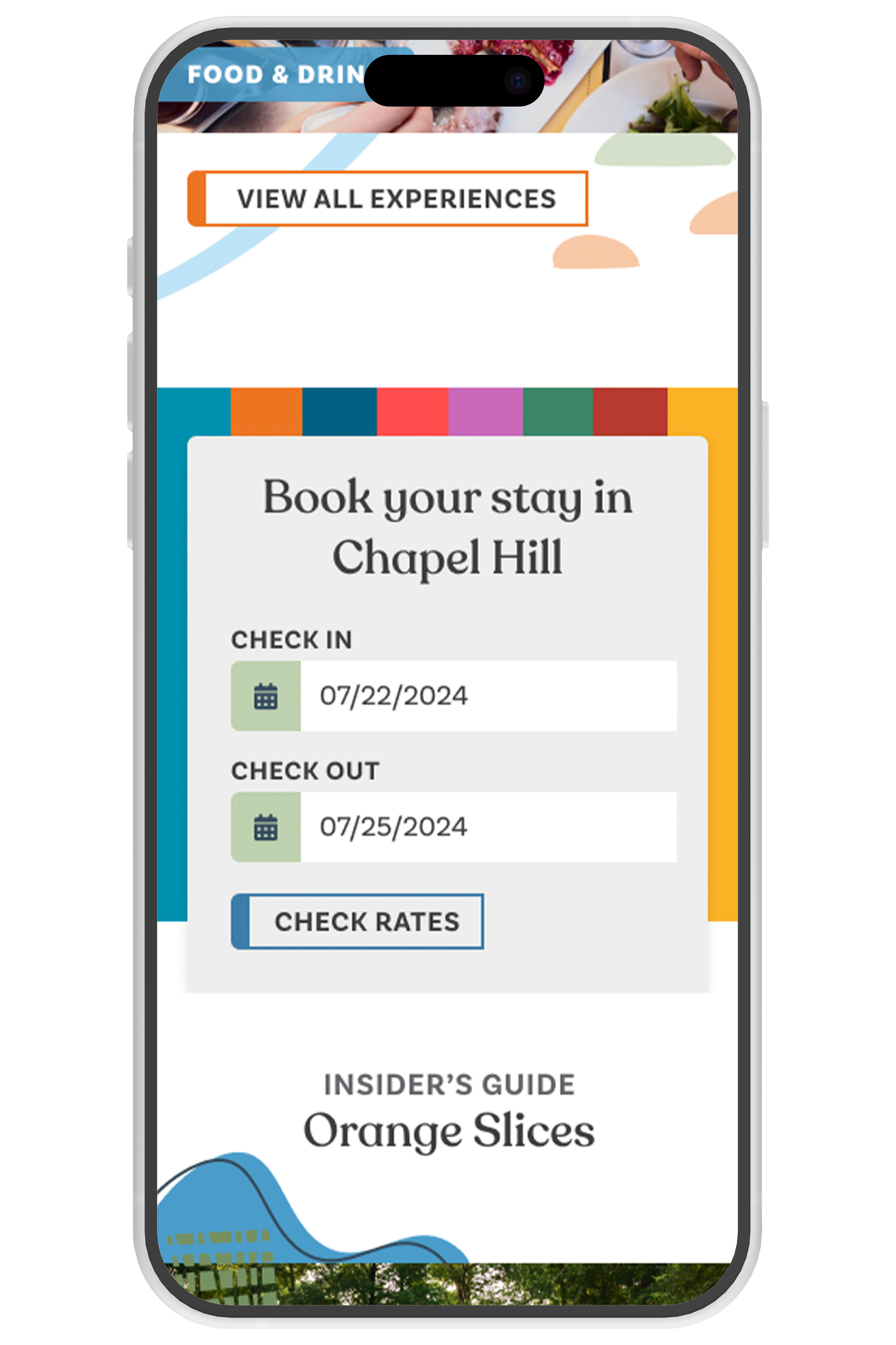
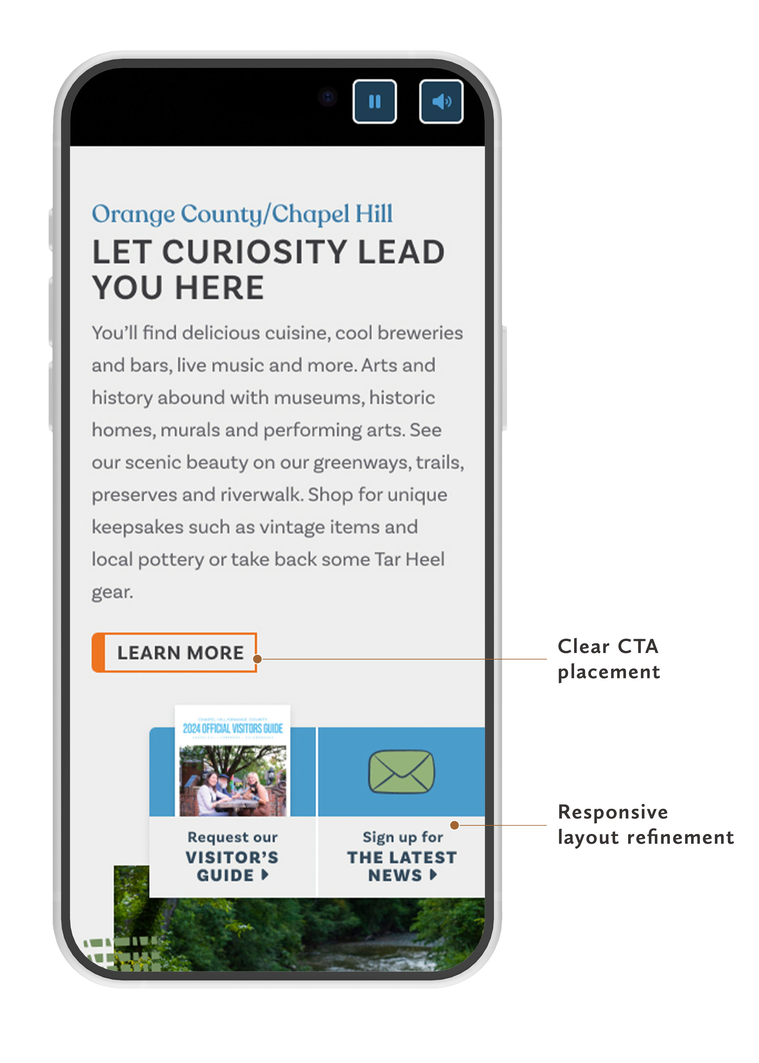
Responsive Visual System Brand styling, typography, spacing, and modular components carried consistently into the mobile experience.
The visual direction needed to feel warm, modern, and approachable while supporting readability and accessibility. I refined the existing brand expression to create a more welcoming digital experience that allowed Chapel Hill’s stories and community to shine.
Key focus areas:
Updated the brand blue to meet WCAG contrast standards
Refined the color palette to create a calmer, more comfortable visual experience
Applied sentence-case headlines and left-aligned typography to improve readability
Created modular layouts and reusable patterns to support content flexibility
Designed responsive experiences with mobile usability in mind
User Experience
The UX strategy focused on making the experience simpler, more intuitive, and easier to navigate. Through research, usability testing, and collaboration with cross-functional teams, I designed solutions that reduced friction and helped visitors confidently find what they needed.
Key focus areas:
Reorganized navigation and user flows around visitor needs
Mapped key journeys for events, listings, and trip planning
Created and refined wireframes through internal usability feedback
Improved hierarchy, spacing, and content grouping for easier scanning
Partnered with PMs and developers to ensure designs were practical and scalable

Early homepage wireframe layout
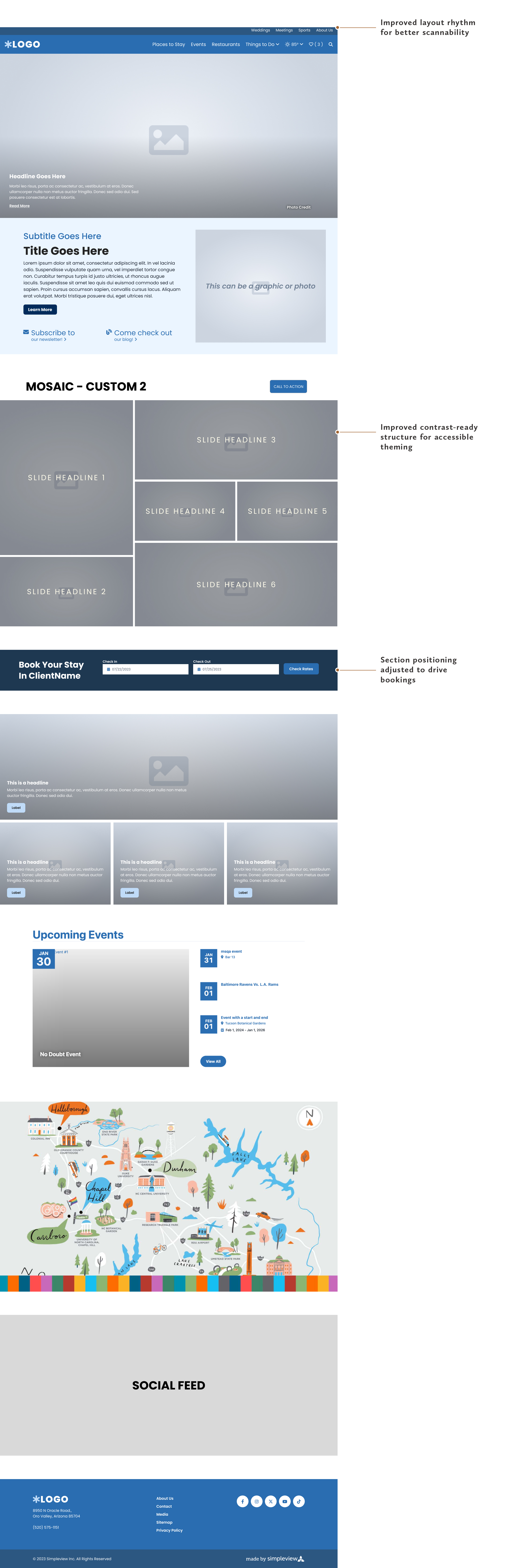
Refined homepage wireframe layout
03 Design Evolution
The final experience brought together UX strategy, accessibility considerations, and Chapel Hill’s brand personality into a flexible digital system.
Before & After
The redesign transformed a content-heavy experience into clearer, more engaging journey for visitors.
Wireframes & UX Exploration
Before moving into high-fidelity design, I explored page structures and content hierarchy to ensure the experience was intuitive across devices.
High-Fidelity UI
The final designs created a modern, welcoming experience while maintaining flexibility for future content needs.
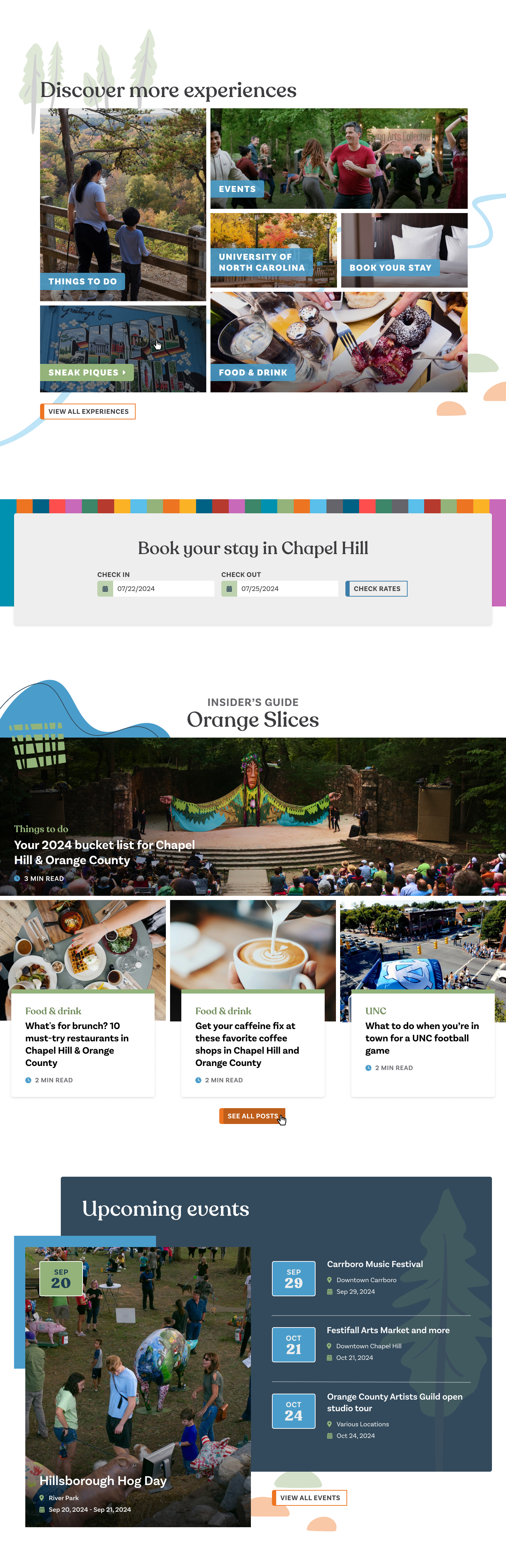
Modular Content System Flexible content blocks create a consistent visual rhythm while supporting destination storytelling, discovery, and trip-planning actions.
04 Expanding the Experience
Beyond the main leisure website, the project expanded into two additional experiences that extended Chapel Hill’s digital storytelling and accessibility efforts.
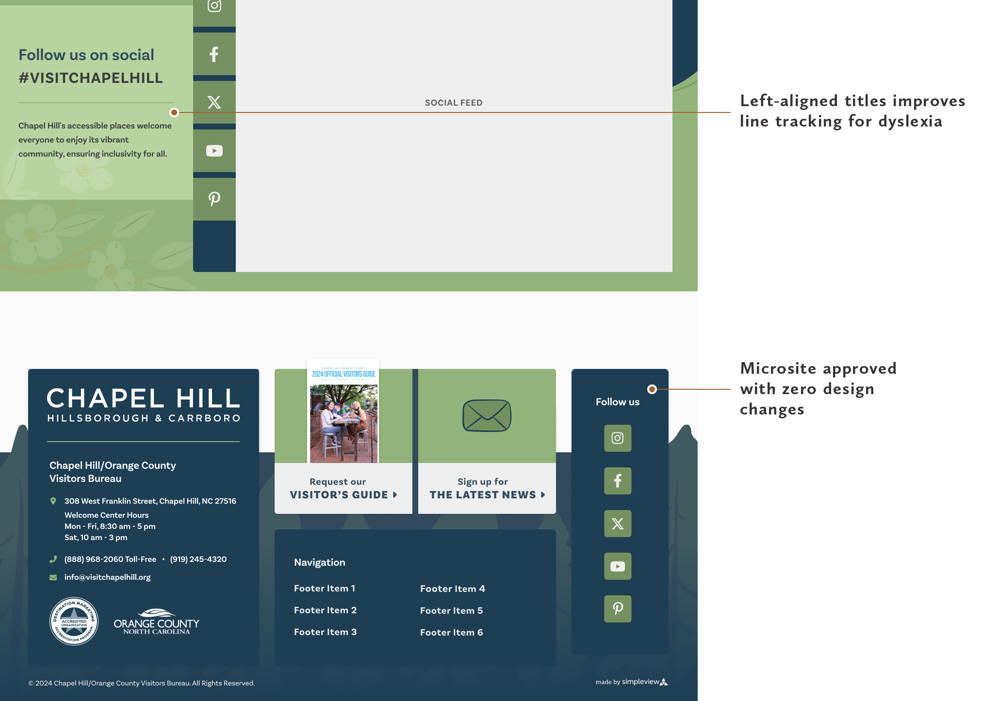
Accessibility Microsite
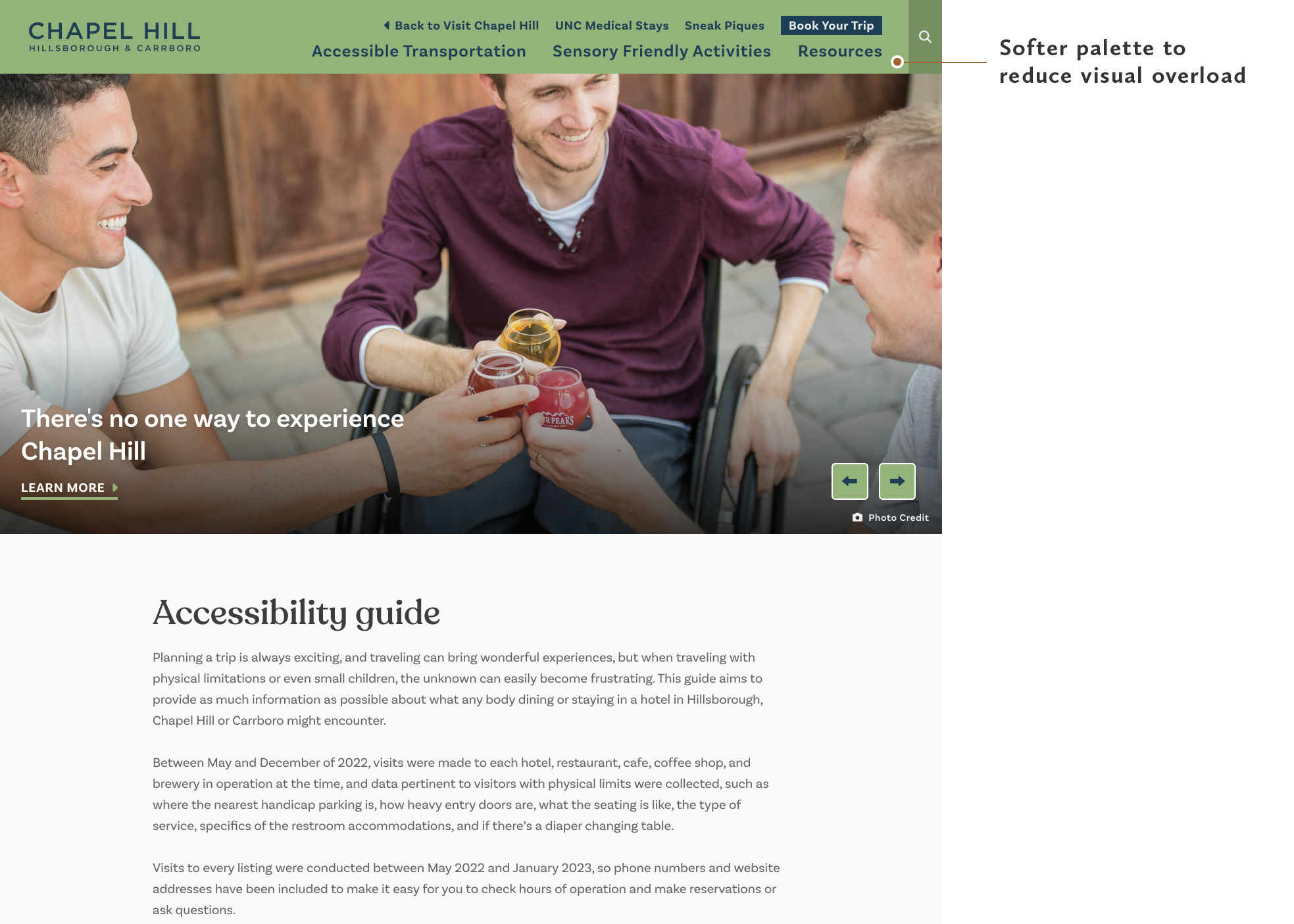
The accessibility microsite was designed to help visitors better understand and plan for accessible experiences throughout Chapel Hill.
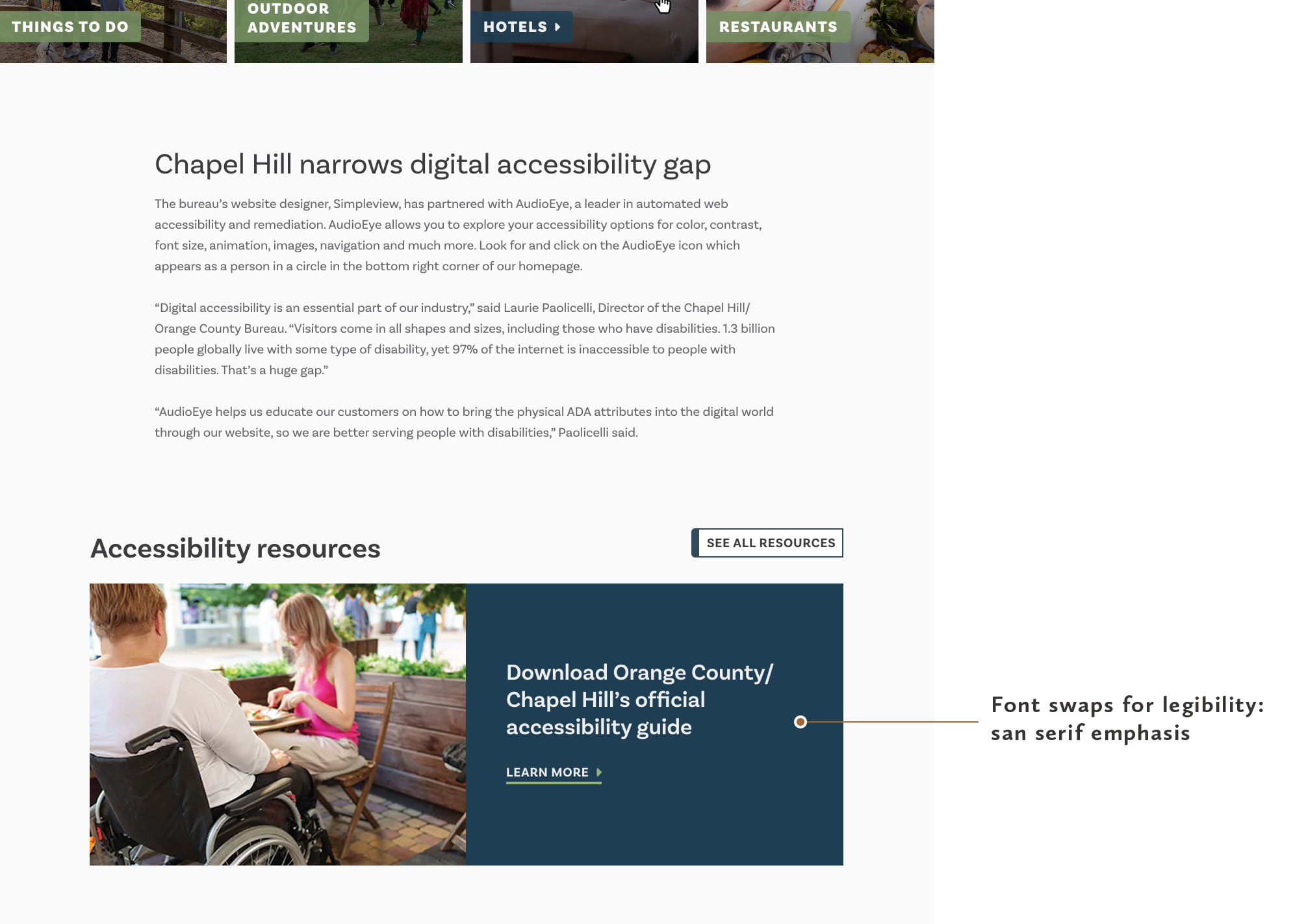
The experience focused on clarity, predictability, and reducing barriers through thoughtful content organization and accessible design decisions.
Key considerations:
Clear content hierarchy
Readable typography
Predictable layouts
Reduced visual complexity
Accessible color choices
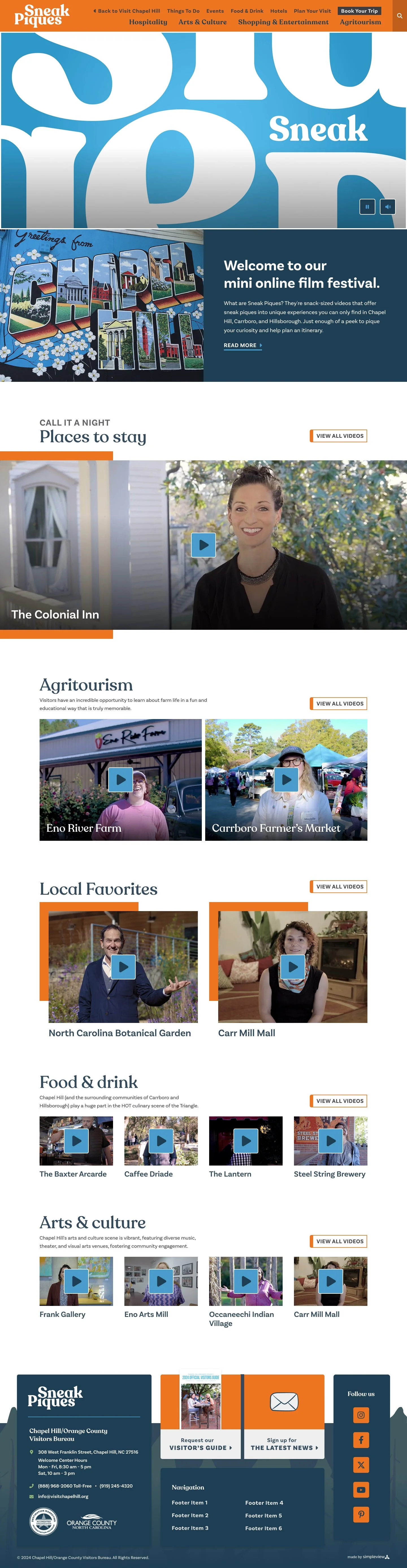
Sneak Piques Microsite
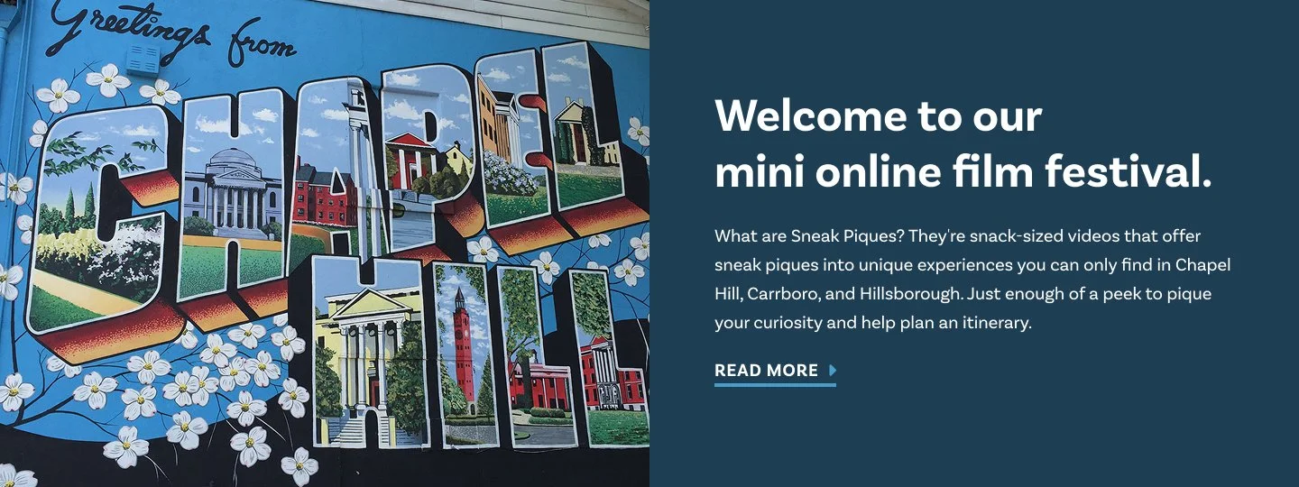
Sneak Piques was created as a storytelling experience that encouraged visitors to discover Chapel Hill through local voices, hidden gems, and community recommendations.
Impact
All three digital experiences launched successfully with minimal revisions, supported by a unified design system that created greater consistency and flexibility across the main site and two microsites.
95%
UX retention rate
96%
Highest Lighthouse accessibility score
3
Digital experiences launched
1
Unified design system
Lighthouse accessibility scores reached 96% for Sneak Piques, 93% for the Accessibility Microsite, and 87% for the main leisure website.
Beyond the launch, the project helped open up broader conversations around accessibility within the organization and led to a published article and internal presentation on neurodivergent-friendly web design.
This project reflects how I approach digital design: bringing together thoughtful UX, visual storytelling, accessibility, and flexible systems to create experiences that work for both visitors and the teams managing them.
In Collaboration with
Project Manager: Christine Tobias
Lead Developer: Rebecca Amaya
Creative Lead: Dennis Reno
Tools & Platforms
Figma